Color Trends

PHOTOGRAPHY PROVIDED BY GRACE HOME FURNISHINGS
According to our design experts, color is in and it’s not going anywhere!
Color immediately sets the tone for a space and helps identify the function of a room. A soft, natural blue in a living area expresses comfort. A bold red accent wall in a dining room brings a touch of energy and charisma. A blush powder room is instantly more fresh and modern.
Look inside for some of our favorite ways to incorporate a little color into your home. Pick a favorite and embrace it!
PHOTOGRAPHY PROVIDED BY ANNE CARR DESIGNS

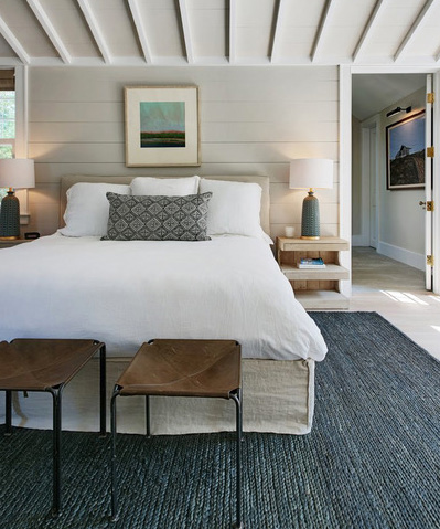
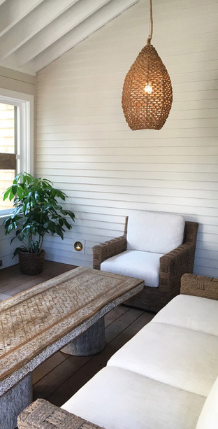
SOFT + NATURAL
“Many homeowners these days are trying to cultivate a resort meditative energy in their home by incorporating grays, whites, misty ocean blues, and accenting with decorative tile floors. Modern Farmhouse Chic has also remained very popular. The relaxed feeling of soft sofas, textured area rugs on wood floors, and splashes of modern gold fixtures provide a perfect juxtaposition of comfort and contemporary style that people just can’t seem to get enough of!”
- Lynne Meintel Interior Design & Consultation
“Overall the vibe for 2018 has been a much more earthy and organic feeling than last year. People are hungry for colors and textures that feel warm and lived in. We have traded bright white for sandy off whites, denim blue is now softer and more earthy, pink is now more peach, gray is more like driftwood.”
– Portola Paints & Glazes
“It seemed like it was only yesterday when all you saw was gray interiors. Although the neutral trend, and we do consider gray a neutral, is still hot in Southern California it appears to be mixed with warmer tones of muted colors and any shades that are reminiscent of nature. Designers are really using a lot of textural fabrics and wood options in their décor so it’s only natural that we are seeing a lot of muddied neutral colors- with names like flagstone, peach skin, mortar, graphite, brackish and acorn you start to get our point. This isn’t to say that we still don’t see your basics of blue, pink and green. It is just that those colors appear softer, mellower and more ephemeral.”
- Anne Carr Designs

PHOTOGRAPHY PROVIDED BY GRACE HOME FURNISHINGs

BOLD + VIBRANT
“Benjamin Moore & Co.’s color of the year is Caliente, a beautiful red that’s “is strong, radiant and full of energy.” Wow and intrigue your guests by trying this color in your dining room with a statement chandelier. It’s almost like putting on a red lip, it provides instant glamour and impact.”
- Lynne Meintel Interior Design & Consultation
“In recent years, color trends have traditionally leaned a little safer, sticking to more neutral and less saturated colors. 2018 has really bucked that trend, embracing much bolder colors. We think that Pantone naming Ultra Violet the 2018 Color of the Year really set the tone for people using more striking and impactful colors.”
– Studio Life/Style
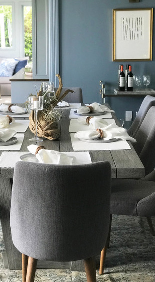
“We have recently seen a lot of navy blue in interiors – sometimes contrasting with white, but often mixed in with yellow, orange or green.”
– Grace Home Furnishing

PHOTOGRAPHY PROVIDED BY GRACE HOME FURNISHINGs

THE NEW NEUTRAL
“Blush tones can almost be considered a neutral and we are loving using these in our designs. Pinks have gained so much popularity over the last few years and we really don’t see this trend going out of style any time soon. Pink has transitioned from a color usually considered juvenile to being a sophisticated color that appeals to so many.”
– Studio Life/Style
SEE WHAT OUR INTERIOR DESIGN
EXPERTS CAN DO FOR YOU
Lynne Meintel Interior Design & Consultation | lynnmeintelinteriors@gmail.com